Talent platform: Redesigning onboarding so students could actually get hired
Recruiting SaaS
Onboarding
Design system
Focus: Usability, Onboarding, Activation
" height="10.5px" id="s2C4vunYy" transform="translate(2 1)" width="8px"/></svg>)
Basic Information
" height="12px" id="Qgy78J7YB" width="14px"/></svg>)
" height="10.000001431727423px" id="DDOgJPdjv" transform="translate(1 1.5)" width="10px"/></svg>)
Education
" height="10px" id="OeTQ5rmSH" transform="translate(1 1)" width="10px"/></svg>)
Work Experience
" height="9px" id="NszJZKXms" transform="translate(1 2)" width="10px"/></svg>)
Skills and Languages
" height="10px" id="R86Y9HDLn" transform="translate(1 1)" width="10px"/></svg>)
Certifications
" height="9px" id="A6IGye5Ws" transform="translate(1 2)" width="10px"/></svg>)
Published work
" height="10px" id="paAvatKAy" transform="translate(1 1)" width="10px"/></svg>)
Summary
Students were signing up to get hired, then stalling on a confusing profile. System Usability Scale testing with 8 students scored 46/100. Profile completion sat at 35%.
I rebuilt onboarding around one next step at a time, then used that same work to start a component library so the team could keep shipping. After the redesign, SUS moved to 78/100 and profile completion to 72%.
The problem
This was a talent cloud for Indian students looking for jobs. Activation was the leak. People arrived motivated to get hired, opened the profile, and did not know where to begin. The flow asked for too much at once. The homepage after signup did not tell them what to do next. Design was inconsistent, which made every new screen feel like a new product.
The startup needed a win without a long research programme, and without slowing the feature train.
If I had waited for a full study or a standalone design-system project, nothing would have shipped in time
to change activation.
My Role
I was the product designer on this. I owned onboarding, the post-signup homepage, testing, and the first component library.
I decided to treat onboarding as the wedge, not as one item on a four-point task list. Fix the moment students got stuck, measure it, and let the system and the UX practice come out of that work. The alternative was four parallel workstreams (research, onboarding, homepage, design system) that would all stay thin.
The key decision: prioritize the daily task loop over an analytics-first product
Testing showed the same two things: students felt overwhelmed, and they were unsure where to start. They were not confused about the product’s purpose. They wanted to get hired. They needed a path.
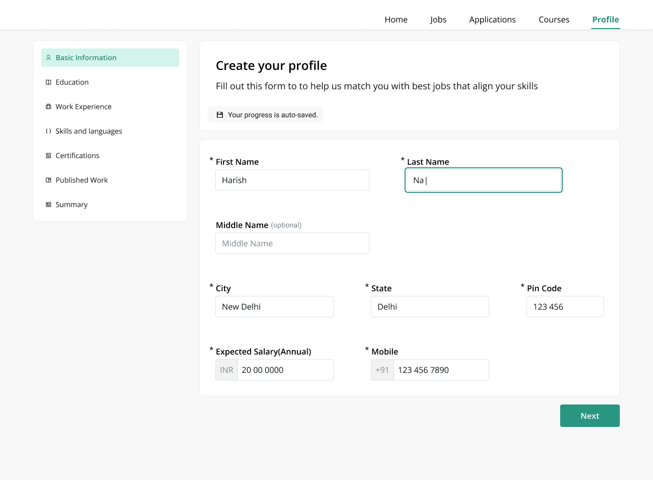
I designed the profile as focused, single-action screens with a visible section list (basic information, education, work, skills, and so on), progress that auto-saved, and a clear completion state that pointed to a next action.
A dedicated skills page carried hints in context, instead of burying skills in a long form.
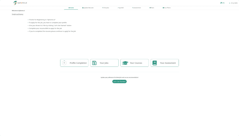
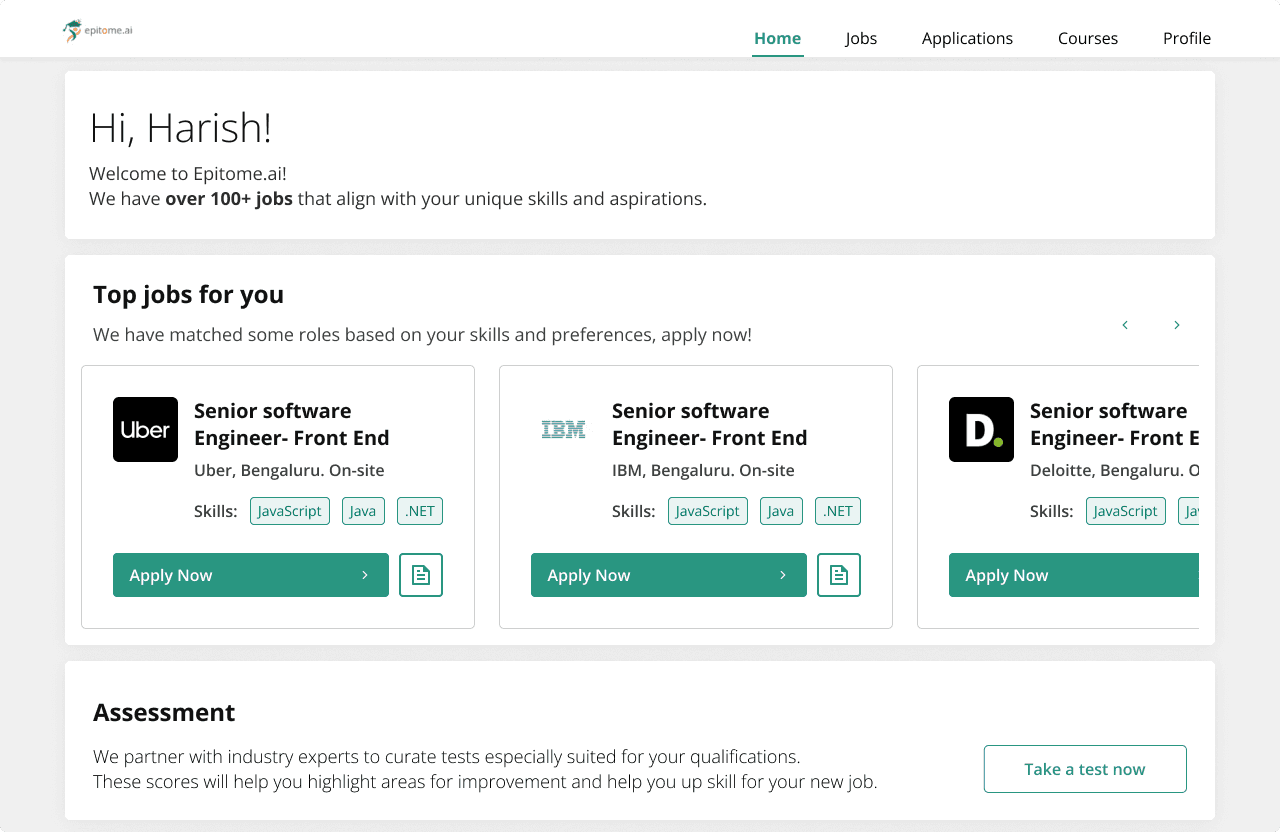
I then pointed the homepage at the same job: apply for roles that match you, or take an assessment. The dashboard had to answer “what do I do now?” not “here is the whole product.”
Before
After
The challenge: ship UX without a research pause
There was no appetite for traditional research, and releases could not wait. If I had insisted on a separate discovery phase, I would have lost the room. If I had skipped evidence entirely, I would have been decorating a flow students already abandoned.
What I did instead: SUS with 8 students to get a baseline (46/100), then multiple testing rounds to find the exact stall points. I simplified profile sections, progress states, and next-step prompts from that. I built the component library as a byproduct of the onboarding screens (nav states, cards, form patterns, handoff notes), not as a side project that blocked features.
Navigation for multi-step form with progress indicators
Default State
" height="10.5px" id="cGwobsYhE" transform="translate(2 0.5)" width="8px"/></svg>)
Basic Information
Selected State
Basic Information
Error State- Incomplete
Basic Information
Completed State
Basic Information
" height="12px" id="UuOg7lAIY" transform="translate(1 0)" width="12px"/></svg>)
Selected State-Complete
Basic Information
Selected State-Error
Basic Information
Craft
The profile nav had to carry status, not just location: default, selected, complete, incomplete error, selected-complete, selected-error. That is how a long profile stays scannable without dumping every field on one page.
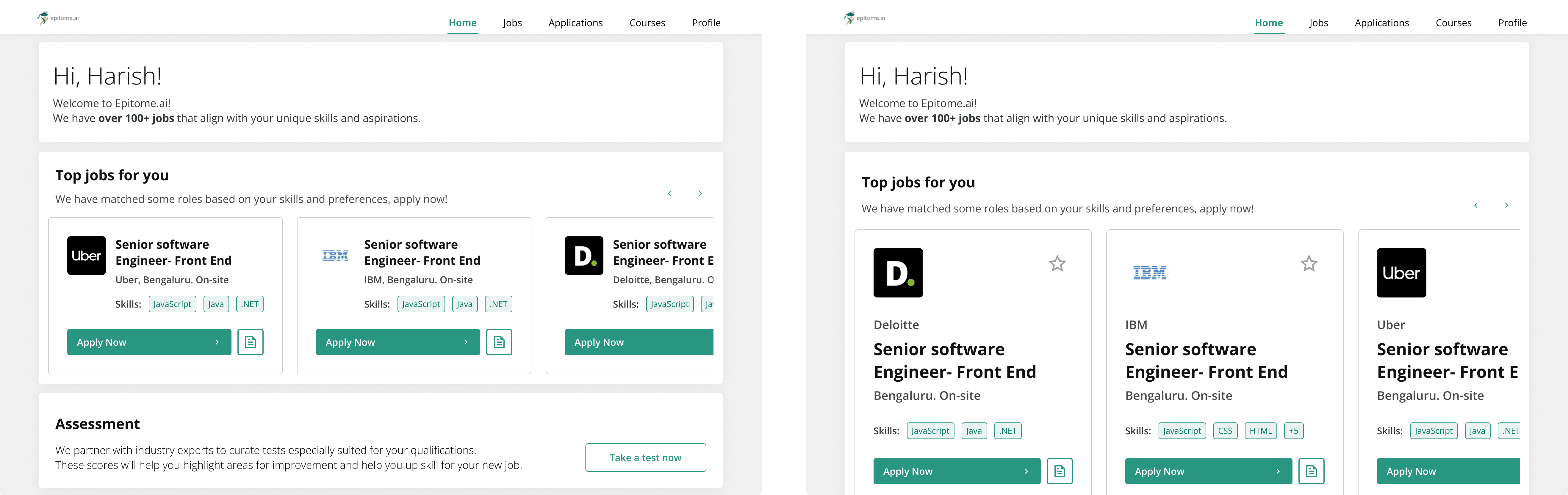
Job cards went through a few explorations (two fat buttons vs one primary apply vs apply plus a compact description control). The version that shipped keeps Apply Now as the action and treats the job description as secondary, so the homepage stays a hiring surface, not a browsing catalogue.
Card component Explorations

Homepage exploration
Outcome
Onboarding usability: SUS 46/100 to 78/100, same method, 8 students.
Activation: Profile completion 35% to 72%, measured on the live recruiting platform after
the redesigned flow.
The component library was built to fit their React stack, not as a separate Figma-only kit. Mapping patterns onto components they already shipped cut later feature deployment by about a week or two (calendar time on a typical new screen, versus designing and handing off from scratch).