An accessibility reviewer I can run while the file is still open
Product design
AI
Accessibility
WCAG 2.1 AA, evidence gates, design-to-code
Accessibility review usually arrives after the UI is already decided. I wanted a first pass I could run while I was still in Paper, not after engineering had built the thing.
I built a Grok bot with one job: WCAG 2.1 Level AA auditor. On a 7-step onboarding, it reported 5 likely issues, 4 that needed verification, 3 recommendations, and 0 confirmed violations. The top finding was the primary teal, sampled at about #299681, at roughly 3.64:1 against white under 1.4.3 Contrast (Minimum).
It would not call keyboard or screen-reader behaviour a confirmed fail from screenshots. That refusal is the point of the system.
The problem
On most teams I have been on, accessibility is a late checkpoint. Designers ship a flow, then someone (or no one) checks contrast, names, and keyboard paths after the structure is locked. By then a teal, a placeholder-only label, or an icon-only delete is already in the system.
I did not have a specialist sitting next to the file. A generic “check this for a11y” prompt is worse than nothing if it invents a pass, or dumps a checklist with no WCAG mapping and no sense of what a screenshot cannot prove.
I needed an always-on first layer: fast enough to use while iterating, strict enough that
I would not trust a fake green tick.

My Role
I designed the onboarding in Paper, wrote the auditor’s role and constraints, ran the first pass on those screens, and also ran it against HTML. I am the designer under review and the person who designed the review.
I decided to build a dedicated reviewer instead of adding accessibility as a line in a chat prompt. The alternative was hoping a general model would “be careful.” That is not a workflow.
The key decision: constrain the auditor, do not ask it to bless the file
I gave the bot a single standard (WCAG 2.1 AA) and a single output shape: evidence → Success Criterion → severity → recommendation → how to verify.
I also told it not to claim compliance, and not to treat missing implementation evidence as a confirmed fail. Findings had to land in confirmed, likely, or needs verification.
I considered the default: paste screenshots and ask “is this accessible?” I rejected that. A screenshot cannot show focus order, accessible names, or what a screen reader says. An auditor that confirms those from pixels is not useful. It is a liability.
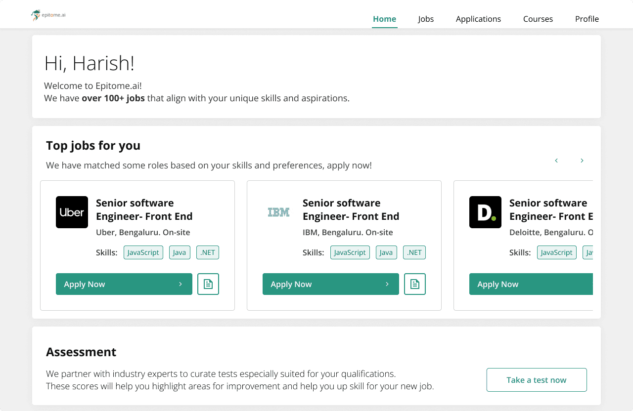
Before
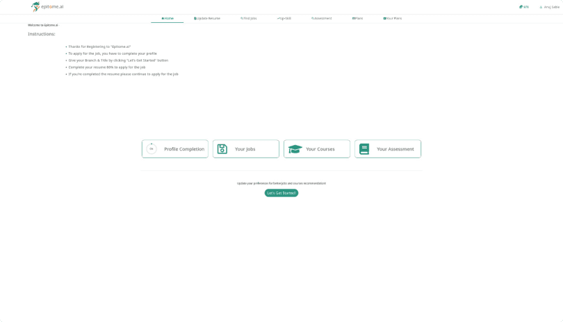
After
The challenge: make it useful without letting it lie
The easy failure is theatre: a long list that looks like an audit. The other failure is silence: a tool so cautious it never tells you the teal fails contrast.
The first 7-step pass sat in between. Highest-priority: primary teal #299681 on white at about 3.64:1, flagged as a likely 1.4.3 issue, with a practical fix (darken the teal or change the pairing). Around that: placeholder-only field identification, low-contrast secondary labels and placeholder text, form-control border contrast, icon-only delete, required-field communication, plus keyboard, focus, and radio labelling parked under verification because the evidence was not the DOM.
When I gave it HTML as well as screenshots, the same constraint still mattered. Markup can support names and structure. It still cannot stand in for a keyboard pass or a screen-reader pass. The bot is a reviewer. It is not a test lab.
Navigation for multi-step form with progress indicators
Default State
" height="10.5px" id="cGwobsYhE" transform="translate(2 0.5)" width="8px"/></svg>)
Basic Information
" height="12px" id="Qgy78J7YB" width="14px"/></svg>)
Selected State
" height="10.5px" id="s2C4vunYy" transform="translate(2 1)" width="8px"/></svg>)
Basic Information
Error State- Incomplete
Basic Information
Completed State
Basic Information
" height="12px" id="UuOg7lAIY" transform="translate(1 0)" width="12px"/></svg>)
Selected State-Complete
Basic Information
Selected State-Error
Basic Information
Craft
The product is the review contract, not a chatbot personality.
Severity is by user impact, not by how easy the issue is to write up. Contrast on a primary action colour outranks a nice-to-have note. Uncertainty is labelled in the same artefact as the finding, so I do not have to remember which items were guesses.
Recommendations have to be something I can do in the file or hand to engineering (darken this token, do not use placeholder as the only label, give the delete control an accessible name). If it cannot say that, it should stay in verification.
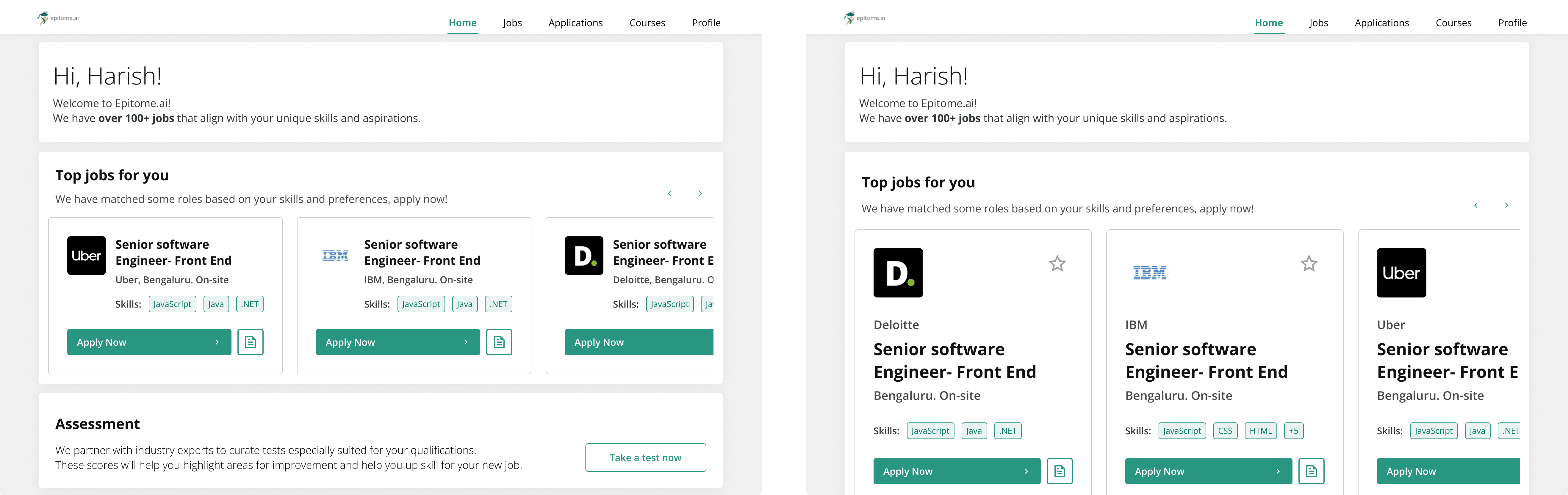
Card component Explorations

Homepage exploration
Outcome
First onboarding audit (7 steps, Paper screens, WCAG 2.1 AA Grok bot):
0 confirmed violations
5 likely
4 needs verification
3 recommendations
Top issue, with method: sampled primary teal #299681 vs white at about 3.64:1, mapped to 1.4.3 Contrast (Minimum) (AA normal text is 4.5:1). Fix: darken the teal or change foreground/background.
I also ran the same auditor on HTML. That is a second evidence type, not a second published scorecard. [PLACEHOLDER: add HTML counts only if you logged them the same way as the 7-step screenshot pass.]
This is not a SUS or completion metric. It is a classified audit log.