Designing a financial operations tool for users who already had a working system
Fintech SaaS
Asset Management
0 to 1 project
Focus: Information architecture, Task management, User testing
The problem
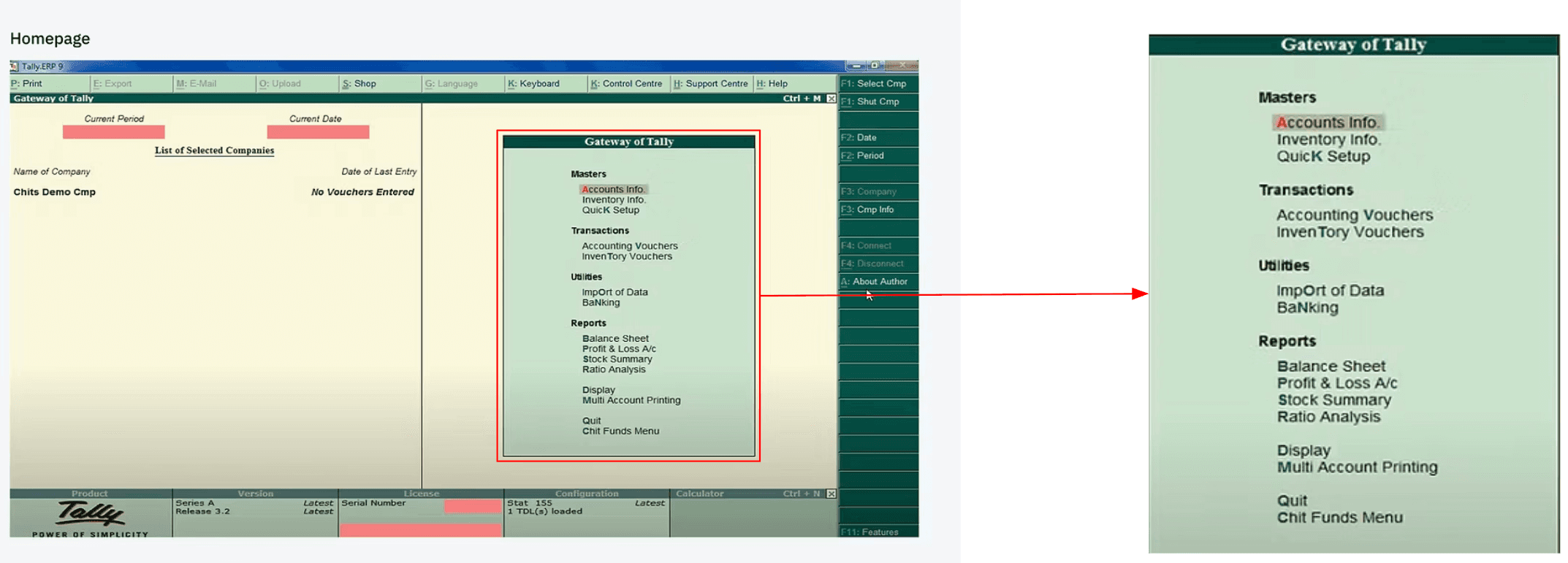
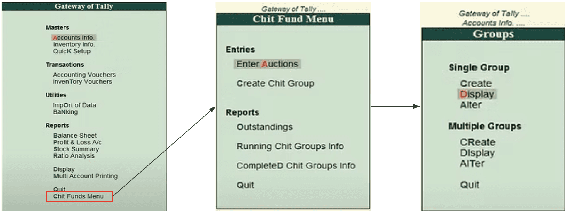
Vanguard Pools are run by operators who collect contributions, disburse payouts on a rotation, and keep every rupee reconcilable. The people doing this work were already power users of a bent workflow: Tally plus Excel and physical paperwork. That stack was customizable, but not optimized for their daily job. It was slow to learn, weak on real-time updates, and heavy on data entry.
Kyepot was building a web product for this domain. Early on, the product still lacked a robust flow and clear IA. Navigation exposed single-group and multi-group data in ways that looked powerful on paper but risked burying the work operators actually had to finish every day. Leadership wanted something in market fast (and later, ML and insight-led growth). Operators needed something else first: finish daily admin fast so they could spend time finding customers and starting new groups.
My Role
I was the lead product designer on a small build team. I owned research, IA, UX/UI, and testing, and I had to move under a hard ship pressure from C-suite stakeholders who had deep product backgrounds in banking and payments.
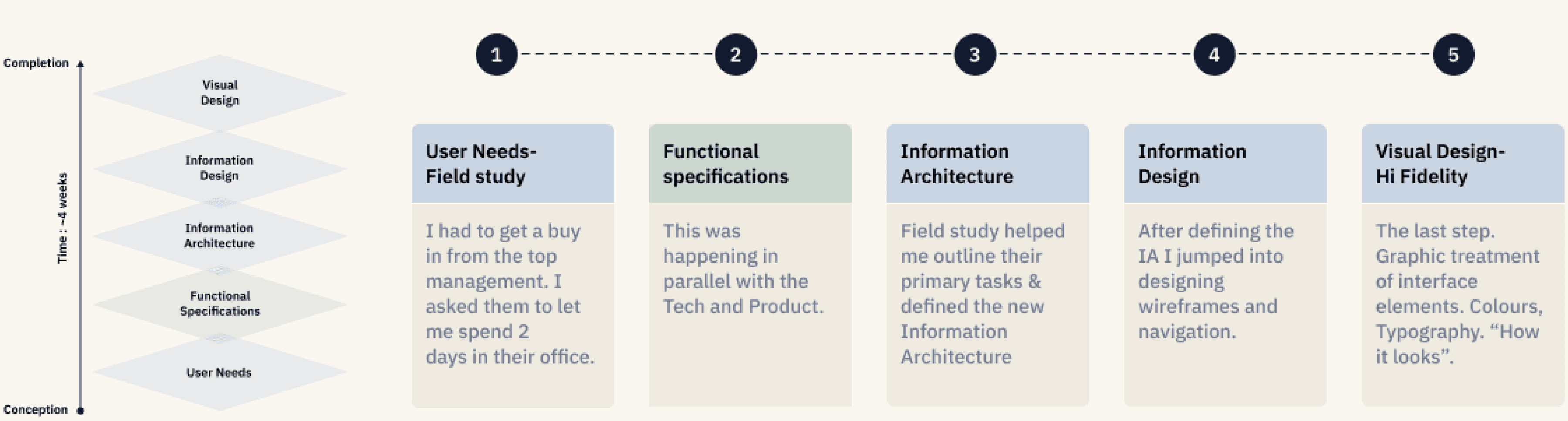
I decided to advocate for a short field study before locking the UI, instead of jumping straight to polished screens. The alternative was designing from feature lists and executive taste alone. I rejected that because the operators already had muscle memory in Tally, and a “pretty” tool that ignored their daily task loop would not get trusted or used.
The key decision: prioritize the daily task loop over an analytics-first product
Leadership energy pulled toward providing features, and data/ML insights that could reduce workload and grow assets. Operator reality pulled the other way: sales targets drive bonuses, so every minute stuck in paperwork is a minute not spent getting customers.
I explored two directions in wireframes:
A: Task-focused: structure the product around the daily work operators must complete.
B: Analytics-focused: lead with reporting and insight surfaces.
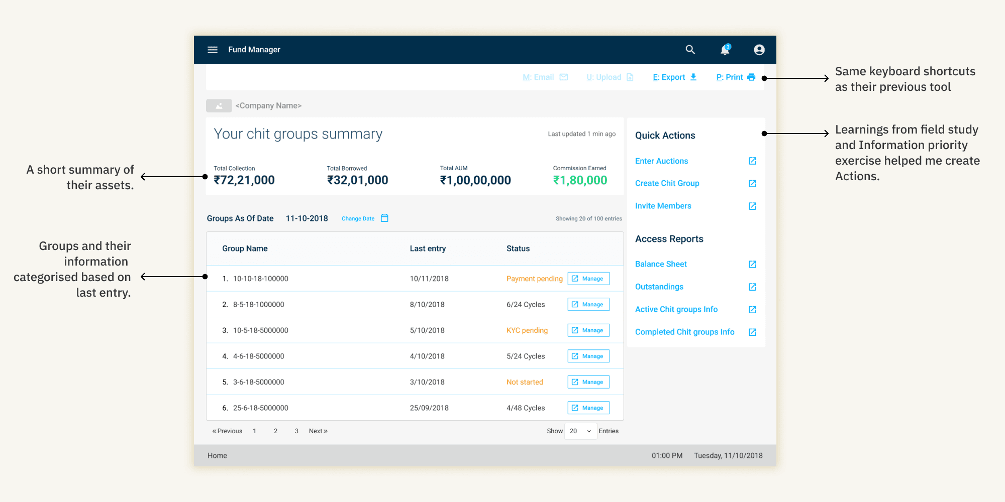
User testing chose A. I decided to ship the task-first information architecture (polyhierarchy, important actions and reports highlighted, navigation shaped by how people seek information in the job) instead of leading with analytics. Insights could come later as a login based view. Trust and adoption had to be earned by making the existing job faster and clearer than Tally + Excel + paper.
That call also answered a concrete IA doubt I carried in: whether complex single-group / multi-group navigation was actually used, or mostly creating load. The winning direction shaved navigation and
cognitive load toward the work that mattered.

The wrong turn/challenge: design without research, as fast as yesterday
From the start, stakeholders pushed: “We don’t want to do any user research, we just want some good designs that look pretty,” and “we need this product out ASAP.” Coming from ex-Head of Product (Bank of America) and VP (Visa) backgrounds, that pressure carried weight. Features mattered to them. Timeline mattered more than process.
If I had complied fully, the case would have become a UI coat of paint on an unvalidated feature set, with a high chance of missing how operators actually finished their day.
What I did instead: a compressed 2-day field study, run carefully and fast enough to still hit the ship pressure. That research surfaced the real job-to-be-done (finish daily tasks → free time for sales), the pain of lengthy data entry across Tally/Excel/paper, and the need for a low learning curve for onboarding asset managers. Those findings, not feature preference, drove the task-first IA and the A/B that followed.
Outcome
Reduced time to create a group and add people by 20%, from ~20 min to ~12 min, measured by timing 3 fund managers completing the same task in the old Tally-based workflow versus the redesigned flow. The baseline was the live pre-project workflow, not an earlier Kyepot iteration.
User testing also showed an 80% task success rate on the evaluated flows.
C-suite signed off on the cleaner direction once the task-first work was visible in high fidelity.