Reducing user task completion time by 50%.
Asset management tool:
I worked on a 0-1 SaaS Product for KyePot. The brief was to introduce
a new tool for foreman to better manage their chit funds.
Role
Worked as the Lead Product Designer for the project. Collaborated with C level executives to design and test the product.
Deliverables
-
User research
-
Iterative design
-
User-experience design
-
User-interface design
-
Wireframing
-
User testing
Team
CEO
CPO
Product Manger
2 Tech(BE+FE)
1 QA
1 Lead Product Designer(Me)
Background
Kyepot's CEO and CPO assigned me with this new task to design a new tool to better manage a Foreman's Chit Fund. They were using a Tally product.
Below are some screenshot I got from the team.


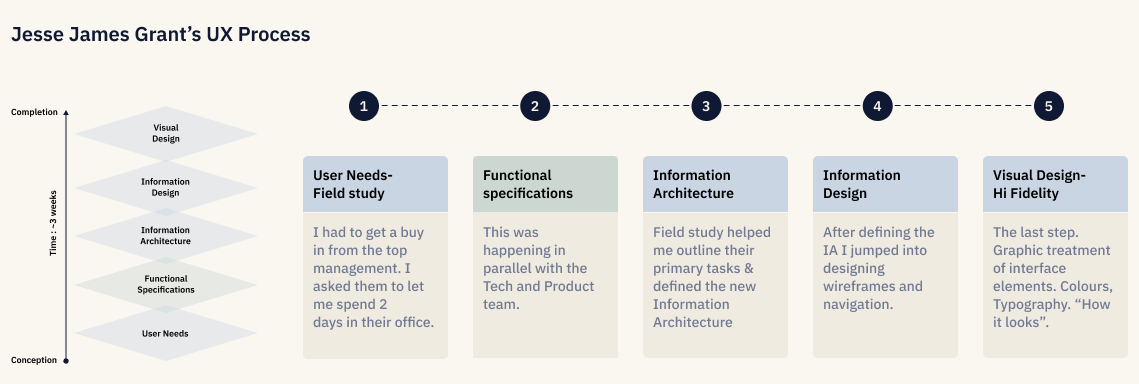
Process


Field Study
In order to understand my users better I had to get involved, observe and interview participants in their environment while they engage in their natural behavior and complete their daily routines.
Day 1-
Direct Observation
Kept my interaction at a minimum during the activity of interest, and reserved my questions usually for
the end of the task.
Day 2-
Contextual Inquiry
I asked open-ended questions to understand what matters most to them. These questions focused on their activities and motivations, exploring both what they were doing and why they were doing it.
Learnings
Users were very task oriented, their motivation was to complete their task and meet their daily goals.
Everyday depending on the status of the group, their tasks were similar.
Outcomes
A deeper understanding of the user needs and pain points.
Defining the
Information Architecture
This was the most important step for me as it helped me synthesise all the data into an information architecture, guiding the structure and navigation, it took me 3 days to create this, but this helped me speed through the visual.

Wireframes and testing
I created two wireframes (below) and tested them with our users. Users prefer clear visibility of their actions over wide analytics. Homepage 1 was the clear winner, and I incorporated input into subsequent versions.
Users preferred ease to complete task over analytics.

Homepage 1 (Winner!)

Homepage 2
MVP


Homepage

UI Style and Components


Outcomes
and Learnings
NPS Score:
75%
This project showed me that your plan will most likely fail and you will have to resort to a backup, whether for user research or team deadlines. This project taught me how to think on my feet.
I was moving along with a lot of assumption and that created a lot of challenges. I had to unlearn a lot of things and listen carefully. Slowly I started to win the trust and by the end of the project I became more humble if not better.
Success Rate:
80%
of our participants were able to complete the task successfully with no error.
Task Duration:
2x
Faster task completion than the old product.
Quick actions were the most popular areas of the web-app.
My hypothesis from the user research was right, which was a huge relief.